
Tin Can
Project Overview 2021
A smartwatch + mobile app for kids and families
Background
A smartwatch and mobile app for kids and families that promotes ambition, responsibility, and self-esteem. The Tin Can smartwatch gives kids autonomy while providing an added safety net for parents. This smartwatch gives your children the tools they need to succeed.
The Tin Can experience considers the whole family. Once a parent signs up they can add multiple accounts for each watch.
Each kid can log into their own profile on mobile and/or watch.
Kids see a simplified view while parents have a more customized view with additional options and preferences to manage their child’s watch.
Goals
Develop brand identity for products and marketing across platforms
Launch native iOS/Android + smartwatch apps
Deliverables
• Design System
• Wire Ideation
• Prototypes
• UX/UI design mobile + watch
Tin Can Team

My Role + Responsibilities
UX/UI Design
Brand Ideation
Prototyping
Design reviews with founders
Synthesis of team feedback
Outline MVP for initial launch
Fast follow feature set
Process
This process can be applied to products at various levels in its life cycle. Meaning it could be centered around a specific feature or feature set for a new product or existing product. You’d typically cycle through this process infinitely as the constraints for a product continue to shift and evolve. In this instance we are always looking to improve the wearable tech and app experience with future releases. To enhance and add new features as our lives change and children grow and become more aware of the world around them. Additionally, we want to add value to the users life by creating a tech experience that compliments and encourages real life experiences.
Research.
Research + Discovery
User Pain Points
Feature Analysis
Analysis.
Define the Problem
User Testing Results
Summary/Strategy
Ideation.
Define Design Principles
Component Narrative
UX Solutions
Design.
Interactive Prototypes
Share back user testing results
Design Critiques
Feedback.
Stakeholder Reviews
Share Summary of User Testing Results
Design Synthesis of Feedback
Iteration + Delivery.
Design Iterations
Design Finesse & Copy Edit
Design Critiques

Research & Discovery
Existing Products
Through some initial research and discovery of existing products we learned there are other similar products in the market but none that had a premium feel.
Our goal is to build out a small MVP feature set initially with the intent to build upon that in future releases.
We Discovered
• Poorly Reviewed (★★☆☆☆)
• Difficult to set up
• Too expensive ($157* - $479)
• Hampered by apps that crash
• Distracting to children
• “Basically the piece of junk
doesn’t freakin’ work” - Actual Review
Analysis
Strategy
Give kids the freedom to explore the boundaries of their neighborhoods, their imaginations, and their lives, without sacrificing their safety.
A typical consumer wants their kids to grow up independent and social, but has safety concerns. They’ve thought about giving their kids a phone, but the high cost and limited control over internet access hold them back. Fitbit lacks functionality and other products are poorly designed. Consumers would gladly spend $150 on a product that just works!

Mission
Tin Can will become the world’s most trusted communication platform, connecting and protecting families and communities. An indispensable tool for families’ lives, every day.
Create an app for parents that connects to a cellular GPS-enabled watch for their kids ages 6-11, and promotes freedom and independence without sacrificing kids’ safety.
For Kids
Trust Tin Can will provide features that inspire adventure, autonomy and help keep them safe.
For Families
Trust Tin Can to accurately track their child’s location, allow them instant access and protect data.
Core Design Principles
Diverse
Diversity + Inclusion. We celebrate our differences.
Adventure + Imagination
From our tone of voice to the user experience everything should be aspirational and exciting. We don’t take ourselves too seriously.
Ambitious + Responsible
We empower little people to think big! We encourage children to try and try again. Being responsible is simply about doing things for yourself. Even if your shirt is on inside out.
Independent
We enable children to grow, learn and perform tasks on their own.
Give kids the tools they need to be successful and in the practice of doing things for themselves everyday they build a greater sense of self.
Accessible
This product should serve diverse abilities, and enhance the usability experience for everyone.
Feature Prioritization

Call
Kids have a parental approved contact list of people they can call.
Guardians see kids call log.

Message
Kids can message their contacts. Guardians see kids message log.

Location
Parent’s see kids location in real time. Kids use this feature to get directions. Option to save frequent locations.

Events
Parent’s can set alarms and create schedules or tasks. Helpful that prompt kids to grow, learn and live autonomously.

Activities
Indoor and outdoor crafts, games, projects and experiments to do as a family. Encourages spending time together.
Countdown
Digital countdowns for all the important fun celebrations in life.
Creative Vision
Style is Subjective
How do we translate core design principles like adventurous, imaginative, premium into a brand identity and specifically UI components?
We must also create a visual language that is forward thinking. Not just meeting the standards we see in the moment or it will feel dated when launched.
Illustration and typography are important parts of creating a brand identity. Most design can feel neutral. The goal is to illicit an emotional response from the design. The right blend of color, typography and illustration can help achieve these goals.
Moodboard
Build a moodboard for the vision of the product. Colors, UI components, animations, illustration, typography etc. Share broadly with the team.
Modern UI Design
What is modern design? When you want something to be current but design trends are in a constant state of evolution where do you push implementation? This can be tricky but easily addressed when thinking about what will add the most value to the end user.
Illustration

The visuals that represent the brand are meant to be friendly, unique and aspirational. 3D illustration helps characters feel real but highly stylized and customizable to help us represent a diverse group of kids. You can achieve more detail than you might in a drawn illustration. 3D or 4D illustration is more modern. We'd have the ability to create micro animations which is all just a subtle nod to new wearable tech where this art is meant to live.

There is joy in color.
Color can elicit an emotional response and it should. It can tell a story and be meaningful and immersive. I wanted this color story to embrace a child-like imagination. The yellow orange for example came from the idea of a school bus. The palette in its entirety creates a color moment that feels whimsical, and the colors feel like they belong together. Sometimes colors can look like they’re vibrating. It's definitely not boring and that’s the point. To help users see and interpret the content, interact with the right elements, and understand actions I made sure to adhere to ADA color compliant guidelines.

Typography
I wanted to achieve a storybook and slightly editorial feel. This serifed font, Quincy CF looks beautiful and elegant at large point sizes. The sans serif font Inter is used for body copy which can be easily read in smaller point sizes. To improve readability, users might increase font size. I followed apple and material design guidelines for font size and line spacing.
Component Library
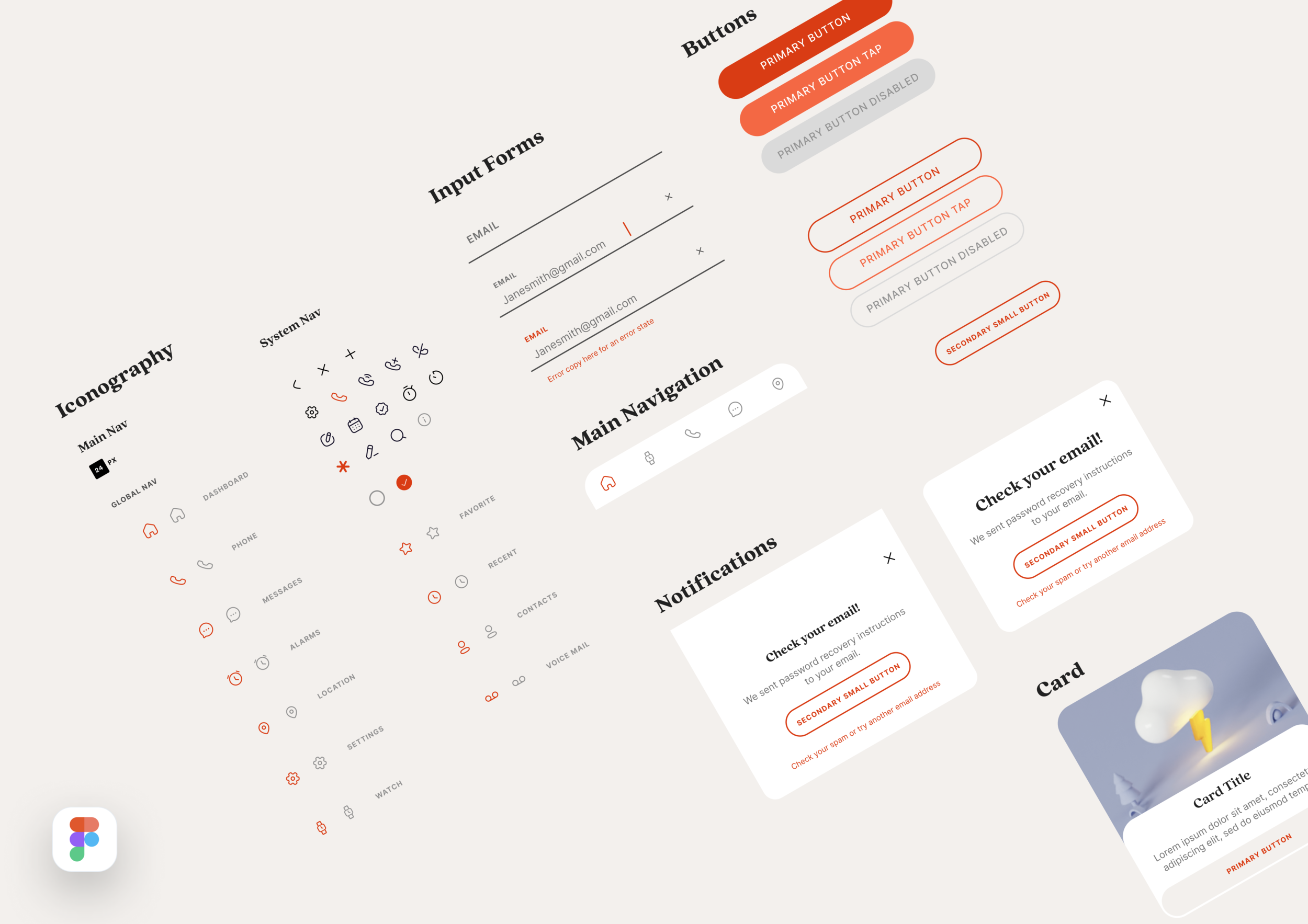
I wanted the visual language to feel modern and playful, so I used rounded corners as much as possible. The iconography is simplified with intentionally rounded accents. You'll notice most current device design has rounded corners so I wanted to create a design that would mimic the shape of the device the design is living within. Any gradients and shadows used are subtle. I followed the material guideline recommendation of making touch targets at least 48 x 48 dp. For example the icon may be 24 x 24 but the touch target would be 48 x 48 ensuring a sizable area to interact with.
Tin Can Mobile App

The guardian has the option to tab between adult only features like call log, message log and locating your child. These features are founded in the idea of creating a safe environment for a child to grow within. Swiping to the kids view allows the guardian to see the content kids interact with and encourages parents to do some of the activities with them. So often technology can deter from real life experiences, we hoped this product would encourage learning and spending more time together as a family.
Tin Can Smartwatch

When you put all the pieces together the vision for the brand is whimsical, adventurous and fun. The goal was to encourage engagement and interaction with the smartwatch on a daily basis. It’s all about creating routine healthy habits.
Prototypes
I typically create prototypes at various levels of fidelity. It’s important to discover what is working and what is not, fix it quickly and move forward.


Key Learnings
This project was actually more complex than I initially thought. Given the complex user personas and various feature sets across guardians and kids. It was fun to crack the code and figure out where it should align vs where it differs.
The team was a pleasure to work with and the developers were absolutely incredible. We worked diligently across a few time zones and made it look effortless.